UI |UX Design | Mobile IOS APP
Self -Discipline Against Screen Time
PROJECT TYPE: Academic
DURATION: 8weeks
TEAM: Solo project
MY ROLE: UI | UX Designer
TOOLS: Figma, Fig jam, Google slides
Overview
During an 8-week capstone project where I developed Unscreened, a mobile IOS app that motivates children to Practice Self-discipline to regulate their screen time. During this project, I utilized the design thinking approach and applied my expertise in UX research, wireframing, user testing, and prototyping.
Design Road Map
My creative process was visualized using the double diamond process.
The process involved 4 phases
Phase 1: Discover through extensive research
Phase 2: Define patterns and insights
Phase 3: Develop a solution through iteration and testing
Phase 4: Deliver a finalized design
Double Diamond Design Process Developed By British Design Council In 2005
Discover
Discover
Problem space
“Parents concerned about the screen time of growing children in a digital environment resulting in health problems.”
SECONDARY RESEARCH
Screen Time
There are many digital devices like mobile, tablets, laptops, gaming consoles, and desktops with different percentages used by kids leading to high screen time.
Health Problems
Due to excessive screen time, children suffer from various health problems. A few of them are hyperactivity, weight gain, attention problem, and ineffective communication. All these are highly concerning for parents.
SECONDARY RESEARCH
Hypothesis
“To ensure that children can reap the benefits of technology without experiencing its potential drawbacks, it is crucial to establish a healthy balance between screen time and other activities.”
I relied on solid intuition despite having multiple assumptions to formulate my hypothesis statement. My hypothesis was correct if at least three out of five interviewers agreed. Let's start interviewing to uncover the problem space and better understand the primary users.
PRIMARY RESEARCH
It is widely recognized that technology overuse can adversely affect physical health, sleep patterns, and social skills in kids. Many parents worry about how technology may affect their children's cognitive abilities, including attention spans and critical thinking skills as well. As a result, I got directed to secondary and primary research to get a more in-depth understanding of the problem space.
PRIMARY RESEARCH
Interviews
To identify and define my problem area, I conducted primary research by interviewing five parents with children between the ages of 5-12 years concerned about health issues caused by excessive screen time.
Analysis
Upon comprehending the pain points, motivations, and behaviors of the parents, I developed several themes. However, my initial hypothesis proved to be correct, leading me to concentrate on the relevant theme.
THEME:
Introducing a creative approach to teach self-discipline in a digital environment to children aged 6-8 years can be a valuable decision. By educating them from the start without lecturing, we can help them navigate the digital world with ease.
Define
Define
HMW
My design challenge prompted me to define the HMW question.
“How might we help parents to encourage kids to develop self-discipline with Screen time so that kids become healthy, positive individuals in today's digital environment ?”
Persona
When making design decisions, having a deep understanding and empathy for the target users can make a huge difference. Archetypes are a valuable tool for gaining insight into customer behavior. Through user interviews, I created a user persona named Kate and kept her needs and preferences in mind throughout the product development process.
Experience Map
The Experience map was crafted to understand Kate’s experience searching for a practical app to educate children on the importance of screen time management. She found many apps but not a single resourceful app for her research. She got agitated as she could not find any relevant app.
User Stories & Task Flow
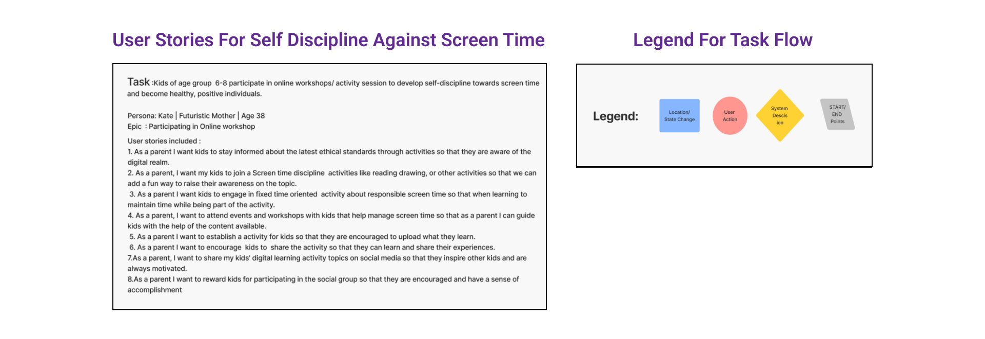
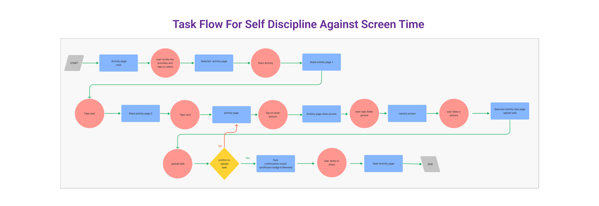
Drawing on my primary research and taking inspiration from the opportunities identified in the experience map, I created a set of user stories to gain insight into how a digital solution may help users like Kate. I authored 30+ user stories which I grouped into three essential epics. I selected the following user story from the core epic,
" Children (6-8) participate in online activities to develop self-discipline towards screen time and become healthy, positive individuals ", to develop as the primary task flow.
Develop
Develop
SKETCHES
As I progressed, I began solidifying my digital solution's purpose. To begin, I crafted as mentioned below:
UI Inspiration Board
Paper Sketches
Grayscale Wireframes
I experimented with various exploratory sketches and eventually refined them into solution sketches for the screens outlined in my task flow diagram.
UI Inspiration Board
The UI inspiration board was instrumental in adding UI functionality to the sketches. It was very helpful in developing the layout while keeping various functional and usability aspects in mind.
2. Paper Sketches
I find that creating paper sketches is a helpful way to solidify my ideas and comprehend them more easily in a tangible format. This ideation technique facilitates quick thinking and proves to be quite useful.
3. Grayscale Wireframes
Converting paper solutions into digital wireframes is a helpful process that allows for a better understanding of the product's possibilities and limitations in reality.
USER TESTING
Once my prototype was operational, I proceeded with two rounds of usability testing comprising ten distinct users. I compiled all the qualitative feedback obtained and employed a prioritization matrix to assess the feasibility and benefit to the user. Listed below are the most significant modifications implemented after the first and second rounds of testing. I have categorized user testing as below:
Task Analysis
Prioritization Matrix
Iterations (Before & After wireframes)
1.Task Analysis
As a product developer, one of the most fulfilling aspects of the job is conducting user testing. This process involves getting qualitative feedback from users to determine the product's user-friendliness. It's an agile process that ensures every step is thoroughly understood and appreciated by the users.
2. Prioritization Matrix
The Prioritization Matrix is a useful tool for determining the effort and importance of a redesign. It helps identify high and low-priority areas for improvement, allowing for efficient allocation of time and resources to be used for the same.
3. Iterations (Before & After Wireframes)
This is an unstoppable process that always leads to the improved design quality of the product in terms of functionality, aesthetics, and understanding.
Hi-Fidelity Grayscale Wireframe
The hi-fi wireframes are the result of multiple iterations that have gone through all the stages mentioned earlier. Achieving the Hi-Fi wireframes of the product brings a great sense of happiness.
Deliver
Deliver
BRANDING
Through my research, I learned that designing for children requires a balance of vibrant and soothing colors that are easy on their eyes. My app focuses on informal education, so I aimed for a positive and forward-thinking approach. I strived for a visual identity that exudes comfort, approachability, optimism, and stability to achieve this. To solidify the design elements I desired, I developed a mood board that reflects these values, which guided my choices for color schemes, logos, wordmarks, app icons, typography, and illustrations.
Mood Board
I created a mood board by exploring ideas and using the word factory. I focused more on A than B to capture the brand’s essence.
Color Palette
Once the mood board was finalized, I was able to determine the colors for the app. It was a wonderful process to achieve the desired brand identity through a golden ratio of 6:3:1 color selection.
Accessibility Test
In my opinion, the brand must prioritize matching accessibility standards. Everyone should have equal access to digital resources that can be helpful, regardless of their circumstances. The Stark plugin aided the testing process in Figma.
Brand Identity
I spent some time experimenting with different designs for our brand's wordmark, a unique typographical treatment of our name. I played with various weights, fonts, and spacing and customized some letters to achieve the result. Additionally, I utilized the wordmark to create an icon for our application. Few explorations are as below:
Typography
The chosen font, Londrina solid typeface, evokes a sense of informal communication, playfulness, flexibility, and balance. It captures a joyful and slightly mischievous spirit that can be appreciated in everyday interactions.
Word Mark and App Icon
The wordmark and application icon were carefully crafted through multiple iterations.
UI Library
I followed the atomic design methodology to compose my design elements.
Atoms - Elements that can’t be broken down further.
Molecules - They are built using several single atoms.
Organisms - Built using several molecules and atoms.
Templates - Outlined blueprints that serve as structures for content filling.
Pages - The last step involves populating the templates with real content.
HI-FIDELITY WIREFRAMES
THE FINAL PRODUCT
And now, we finally arrive at what we've all been anticipating…the finished product! Well, almost.
Adding color to the app turned out to be a challenging task. My primary objective was to ensure that the colors I selected were user-friendly. I had to go through numerous iterations before finally achieving a result that struck the perfect balance. Furthermore, I made several UI element changes to enhance the interface's cleanliness and ease of use.
Below you can see the simple task flow that Kate and her kids follow while using App Unscreened.
Responsive Marketing Website
RESPONSIVE MARKETING WEBSITE
GOING TO MARKET
To promote Unscreened, I developed a marketing website that is responsive and aimed at encouraging users to download the app.
To make this website, I followed a similar approach as I did for my app. I began by getting UI inspiration and making sketches. Then, I designed several rounds of low to mid-fidelity wireframes, tested them with users, and finally applied my brand's visual style to develop a high-fidelity site that users can interact with.
Multi-Platform Exploration
IPad Version
I investigated the possibility of expanding the app to another platform. Considering “Unscreened” is designed for children accustomed to touchscreen technology, I researched how the app would perform on an iPad.
Next Steps
To make the app more engaging for kids, adding more activities that cater to a broader range of interests would be beneficial.
To enhance the integration of screen time in education, it's crucial to communicate with school authorities and the education system. This will facilitate practical improvements in the learning process, as demonstrated in the product.
Key Insights
Design Process:
By following a systematic design approach, you can create an interface that is consistently easy to use and comprehend.
Iteration
Achieving success requires repetition - it takes numerous iterations to develop a product that is both intuitive and user-friendly.
User Testing
Understanding the product and its usability for the intended group is essential, and user testing plays a significant role in achieving this. It contributes significantly to the product's development and its overall success.
Design Principles
Throughout the design process, I discovered that utilizing heuristic evaluations, the law of Gestalt theory, the golden ratio, and many other design principles were incredibly valuable in creating an intuitive product that prioritizes the user's needs.


